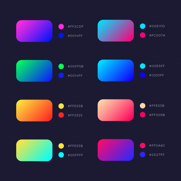
The gradual transition from one colour to another is known as a gradient. It allows the designer to essentially make a brand-new hue. It gives designs a new dimension and gives the object more realism, which helps the product stand out. Gradients essentially add depth.
Yet, a gradual transition from colour to white or black (while experimenting with opacity) might simulate being far or close to a light source. Because flat colours don’t exist in reality, gradients are more true to life.
colourful and dynamic
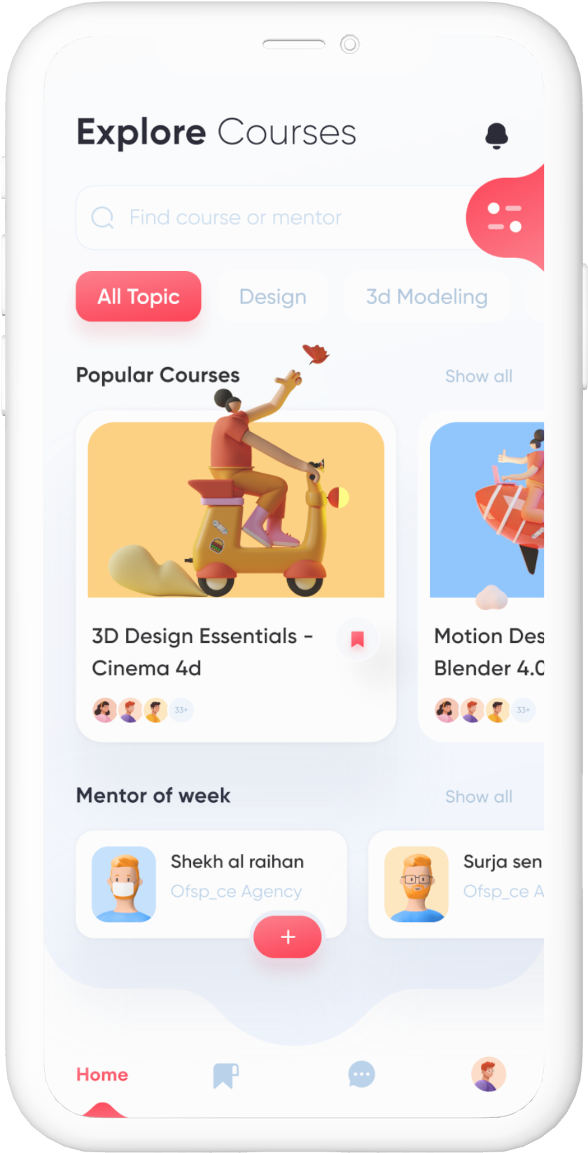
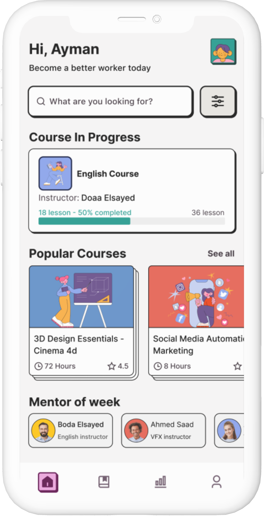
3D Imagery
When assets for UX/UI designs are prepared in a 3D modelling programme, this is referred to as 3D modelling for UX/UI design. Occasionally certain websites or apps call for 3D designs, and creating them in a 2D programme requires a lot of time. As a result, the best approach is to use a 3D modelling programme. To create 3D designs for UX, there is a wide variety of 3D modelling software accessible.
The one that is best for you will depend on your budget and level of knowledge and is used to create 3D designs for UX/UI designs. The most well-liked 3D design software for UX/UI design is SelfCAD, a potent 3D modelling programme. SelfCAD allows UX/UI designers to create both straightforward and complicated models.
A PURE FORM
Brutalism
Brutalism is a harsh, stark, and transparent style used in online design that puts functionality before form and effectiveness before aesthetics. It is distinguished by its unpolished appearance and incredibly straightforward and minimalistic methodology.
In the 1950s, the area of architecture gave birth to the design aesthetic known as brutalism. The French term brut, which means “raw,” is where the word “brutalism” originates.
The old Whitney Museum of American Art building, now known as the Met Breuer, is a prime illustration of how brutalist architecture places function before form:
REMEMBER ABOUT
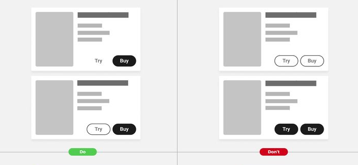
Accessible Designs
Working on accessibility for any product, digital or not, simply entails making it more user-friendly so that anyone can use it conveniently and without experiencing any major difficulties. In other words, it prioritises ALL users and seeks to deliver a consistent user experience across the board.
Making anything accessible forces you to consider how you might make your user interface clearer, more intelligible, and less cluttered. You will need to consider people with low vision, blindness, hearing, motor, cognitive, and situational difficulties, as well as those with low or no digital savvy, during that process.
REMEMBER ABOUT
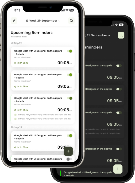
Dark and Light Mode
When we talk about the user’s environment, we don’t just mean the location and timing of the user’s platform interactions. That “when” might simply be referred to as day or night for the purposes of the light vs. dark argument.
Dark interfaces are good for nighttime or evening settings, as you might anticipate, whilst lighter ones are appropriate for the daytime. When seen in a dark environment, a smartphone’s intense bright light can be uncomfortable, while a brilliantly illuminated environment will mask the dark user interface’s muted design.


